Ripple Touch founder, a Life & Mindset Coach, Mentor, NLP Master Practitioner and Hypnotherapist is passionate about helping people discover their inner power and create positive change in their lives.
She initially approached me for a new logo for her coaching business and a promotional flyer for a workshop. As I worked with this client, she then expanded her requirements to include website design.
It was clear from our initial session that my client’s existing company name was not the right fit. I delved deep with my client in a coaching session and from this, a new company name emerged, along with a fresh sense of purpose.
“Ripple Touch” was born!
Brand Identity
I worked with my client to develop the Ripple Touch brand: the brand personality, defining brand values and creating user personas. From this, I created the visual identity to reflect Ripple Touch – the logo, colour palette, typography, brand imagery and language.
COLOUR PALLETTE
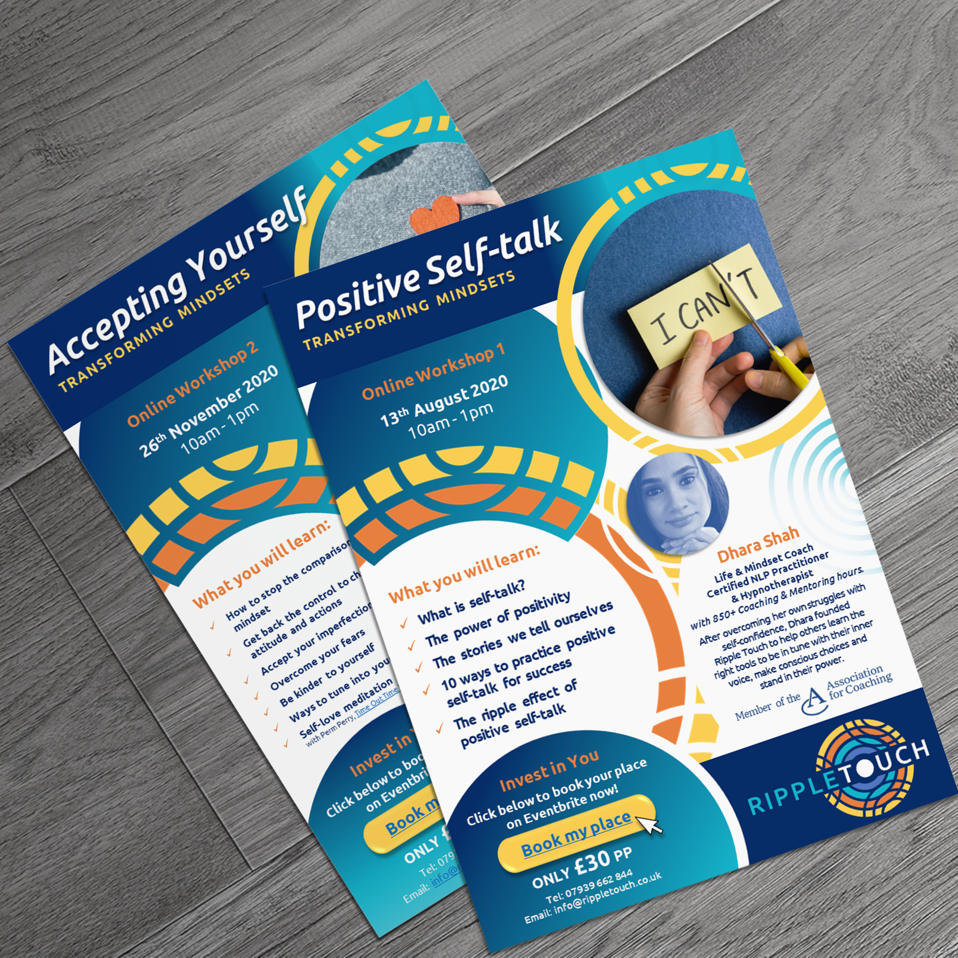
The bright, bold and warm colour palette reflects my client’s personality and was inspired by art work produced by my client after a requirements gathering and brand coaching session.
TYPOGRAPHY
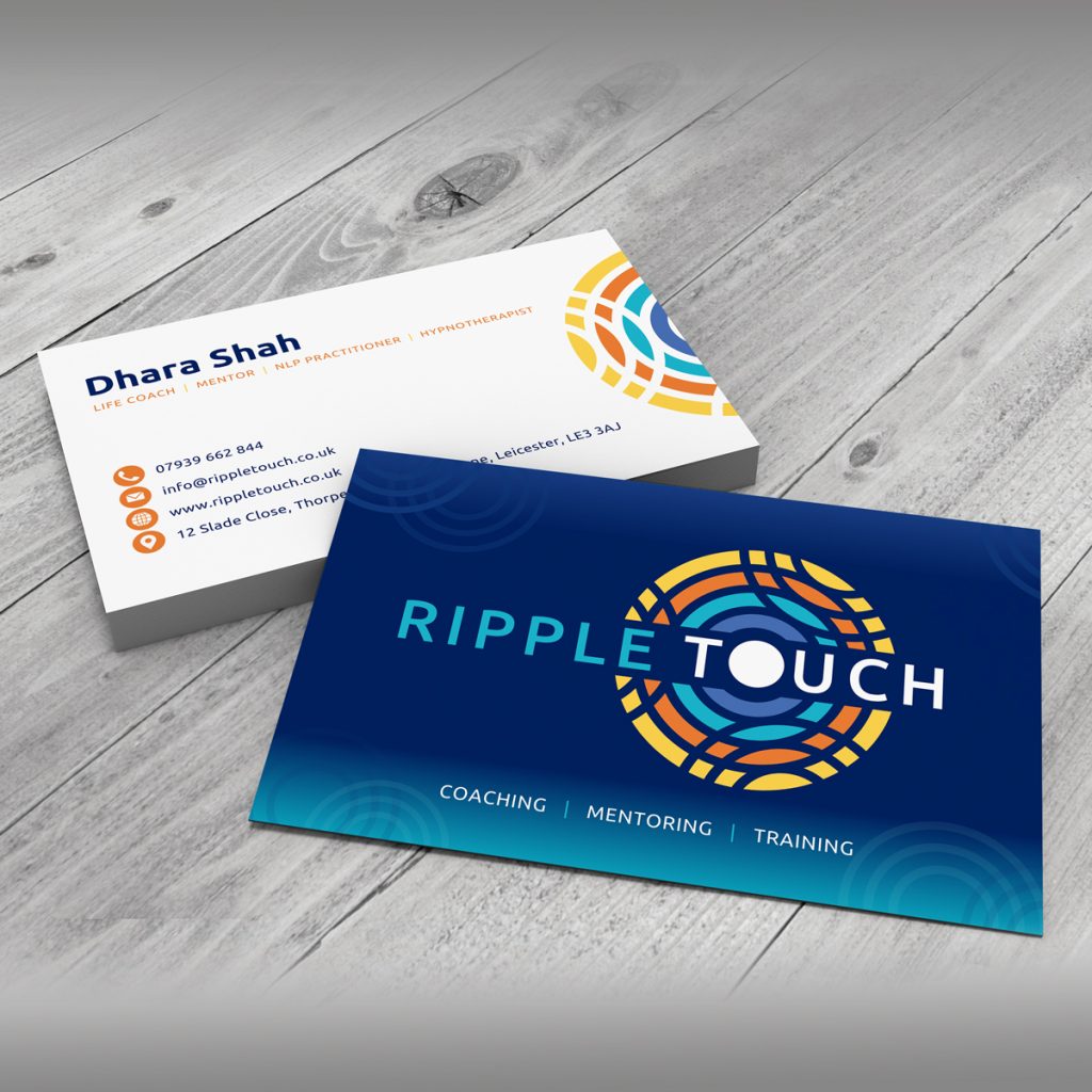
I selected a modern, friendly, versatile yet professional sans-serif typeface Ubuntu for the Ripple Touch brand. It is used in bold, uppercase and light styles for digital and printed assets.
LOGO CONCEPT
The logo concept was inspired by my client’s transformational work and the impact this has Ripple Touch’s clients personally and throughout their lives. This was symbolised by a ripple effect in water.
Graphic Design
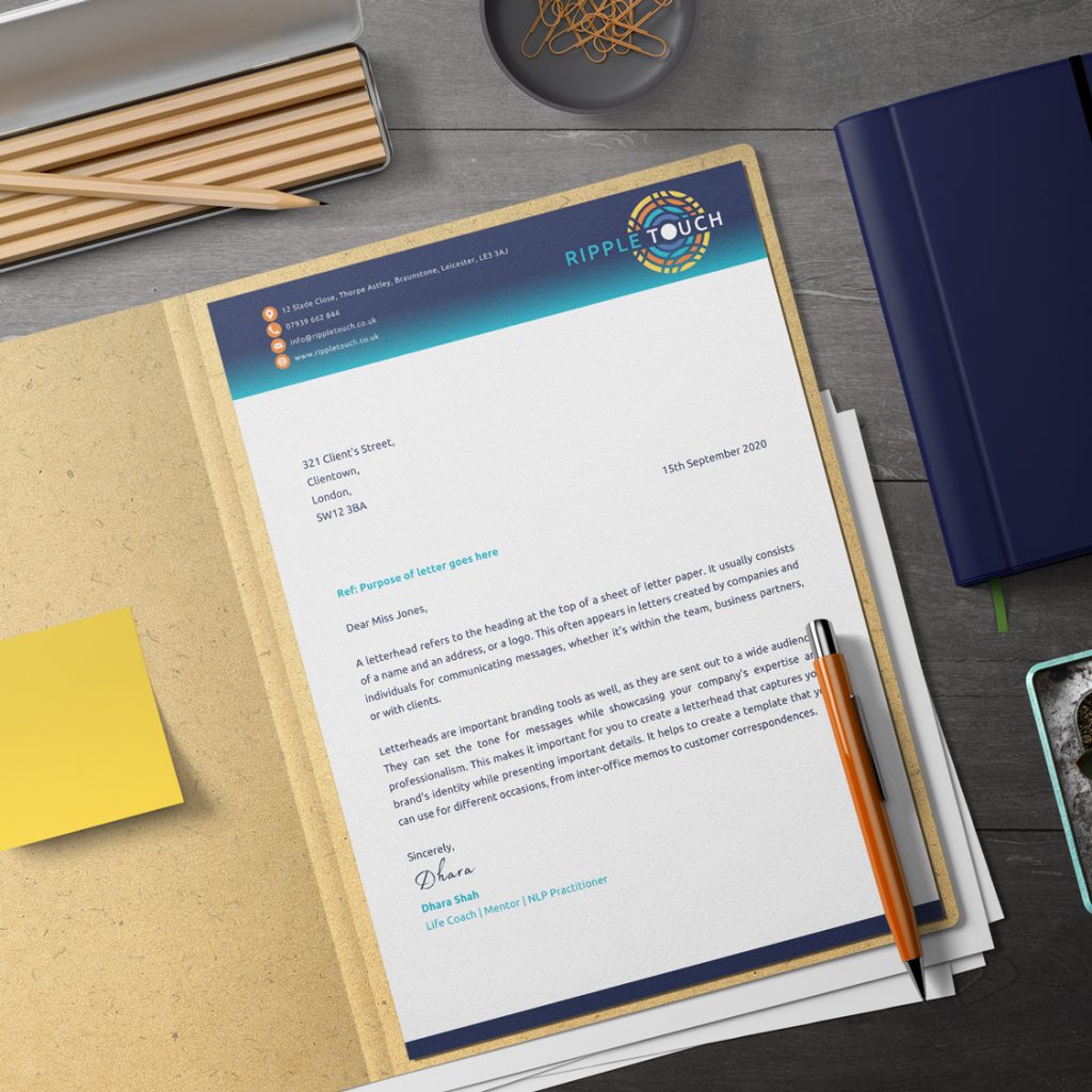
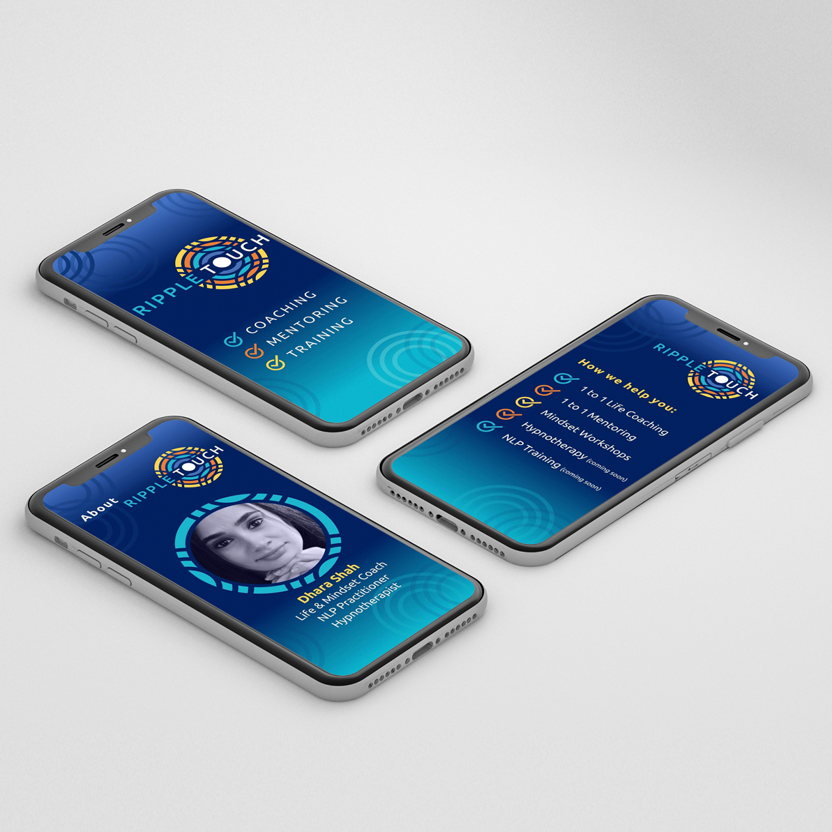
Armed with a brand identity, I designed business cards, letterheads and promotional flyers as well as social media profile headers, event headers and post/story templates for use by client.
Website Design & Build
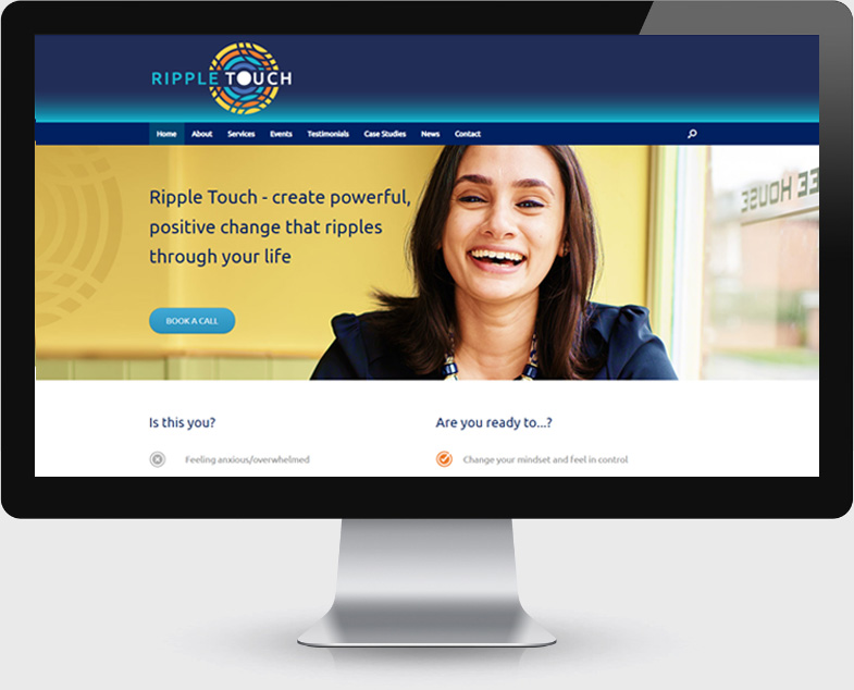
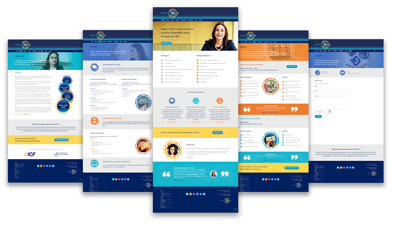
I designed a branded responsive website that showcases Ripple Touch’s varied services, communicates her value to her clients and reflects the brand’s personality.
Web Design Process
Requirements Gathering
Meetings with client to clarify both business requirements and understand end users’ needs/goals.
Research
This involved looking into other coaches in area – what was the competition offering? What worked well on their web sites? It also involved talking to other holistic practitioners. What was working well for them?
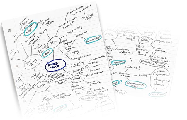
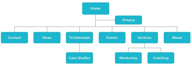
Information Architecture design
Condensing the information gathered into a mind map highlighted potential sections or pages of site which led to the site’s structure.
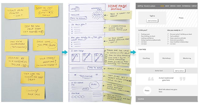
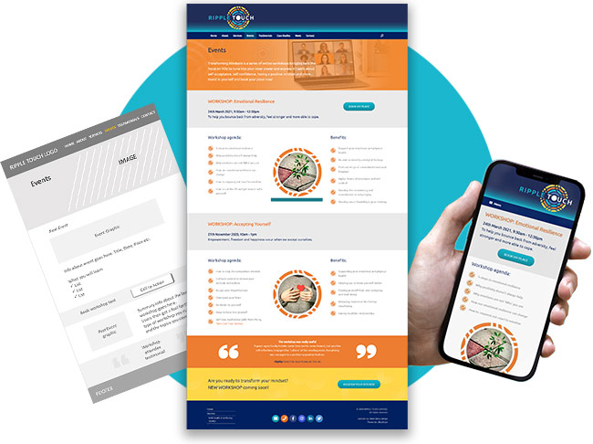
Wireframing
Working out the content and flow of the homepage to benefit client and user was the next challenge. Especially for mobile devices where user is scrolling, could the homepage provide relevant information in a nutshell? Low-fidelity wireframes were created for each page based on content.
Webpage development
Wireframes were combined with Ripple Touch’s visual identity to form branded webpages (created in WordPress).
The Result
The best thing… was Perm’s commitment to understand me, not only as a client, but as a person – who I am and what my purpose is – then, to reflect that in my brand!
Perm is very intuitive in her approach… her attention to detail is phenomenal and she always gives it her all!