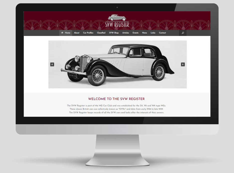
This project was to create a new website for a the SVW Register – a classic car register which is part of the MG Car Club. The site was to provide information and articles about SVW cars, allow users to advertise their cars and spares for sale, provide advice and tips as well as contact details.
Brand Identity
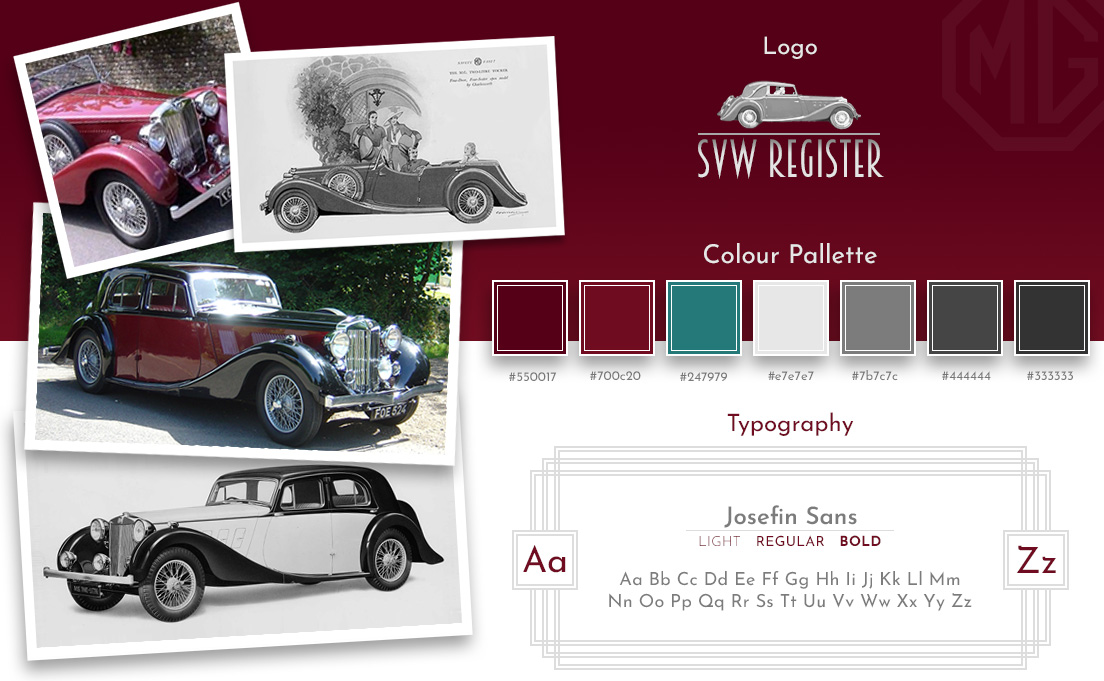
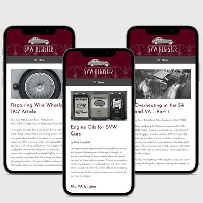
The visual identity for this site was inspired by the cars themselves. “SVW” is shorthand for a range of three models produced by MG in the years 1936 to 1939. As they were designed during the Art Deco period, this influenced the font choices, colour pallette and overall style of the site.
COLOUR PALLETTE
The colours were inspired by the burgundy and deep red body paint colours used by MG on SVWs. The chrome detailing and old black & white press photographs inspired the use of grey and the teal was used as an accent colour for hyperlinks.
TYPOGRAPHY
I chose an elegant, geometric, vintage-style font to give the website an Art Deco feel. Josefin is a clean balanced easy to read sans-serif font which works well for body copy.
LOGO CONCEPT
The logo used Art Deco lettering with a silver gradient and an SA Tickford (from an original MG brochure) separated by a simple line to represent the road.
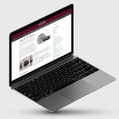
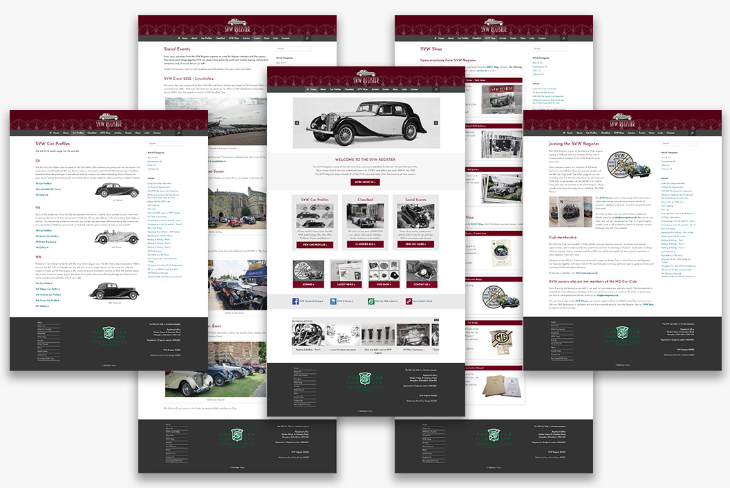
Website Design & Build
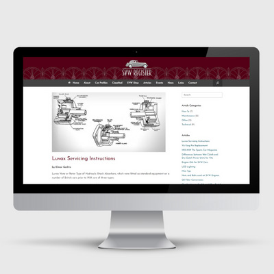
This was a reasonably large site and therefore a longer project, as it had 30 pages, 24 articles and over 300 images!
You have exceeded all our expectations and produced a superb and relevant new website. It retains the Art-Deco styling with easier to navigate content and a natural blend of the black and white pictures with the coloured ones, a real credit to your abilities and skills.
J. Andrews
SVW REGISTER CHAIRMAN
What a huge improvement in both appearance and usability.
C. Plain-Jones
COMMITTEE MEMBER
This looks truly super. I love the look & feel, navigation and functionality – well done.
P. Campbell
‘SAFETY FAST’ MAGAZINE SCRIBE
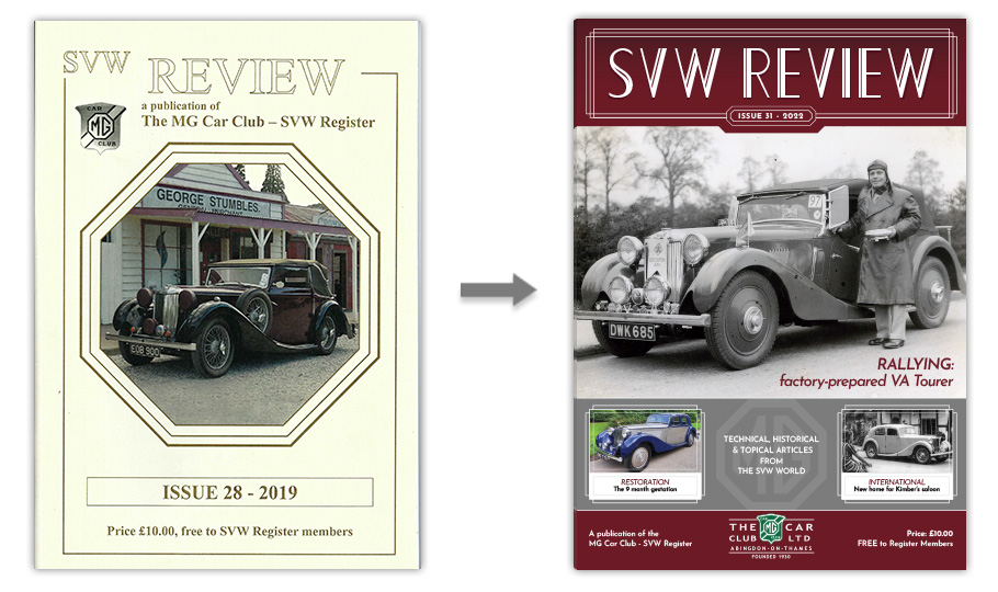
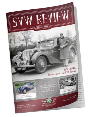
Magazine Cover Design
At a later stage I was asked by the SVW Register to redesign the cover of their yearbook. The SVW Review has been published annually for nearly 30 years and the template for the cover had remained the same for that time. It was a thoroughly enjoyable project to update the design.
New cover with period-feel
I included:
an updated masthead to replace the hand-drawn version of ‘SVW Review’. I used a more stylised Art Deco typeface with decorative vertical line details for the the masthead text,
feature images as well as a full-width main image
lead and feature article headlines,
a smaller MG logo to replace the central octagon shape along with a magazine strapline.
This resulted in a modernised version of the magazine which retained a period-feel.