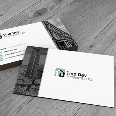
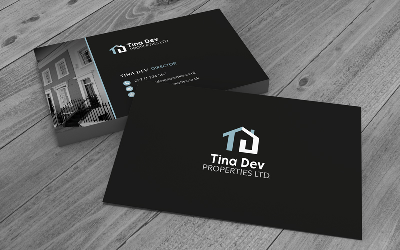
This London-based property company required business cards for an upcoming conference. I had to quickly turn this around creating the logo and business card design ready for print.
Logo Design
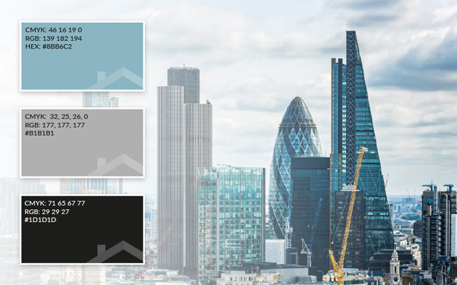
COLOUR PALLETTE
The colours for this property company project were inspired by buildings. Rather than red bricks, the London skyline was the inspiration. The duck egg blue from the glass and the greys from the metal along with the client’s choice of black.
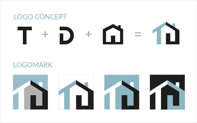
LOGO CONCEPT
The concept for the logo was inspired by the letterforms of the client’s initials combined with a simple representation of property – a house icon.
I created variations on this theme and settled on a flat asymmetric version.
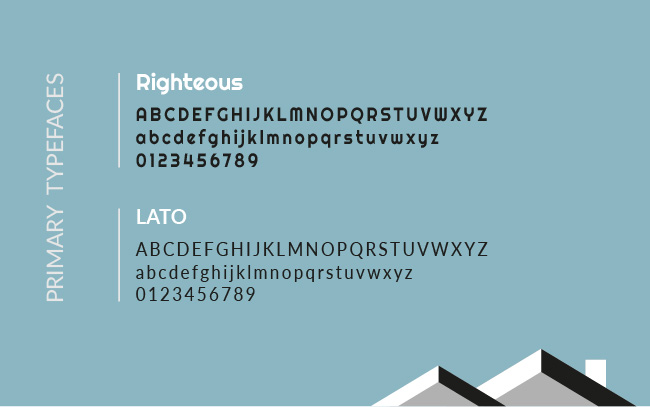
Typography
I chose Righteous for it’s distinctive curved and approachable style paired with modern san-serif typeface Lato which for its clarity in smaller sizes.
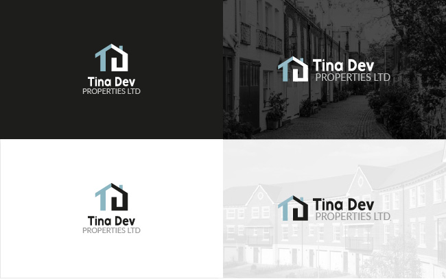
LOGO SYSTEM
Stacked and horizontal versions of the logo were created in white and black to sit on dark and light backgrounds respectively.
LOGO in use
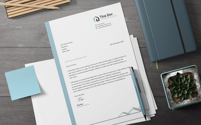
Business letterhead example.
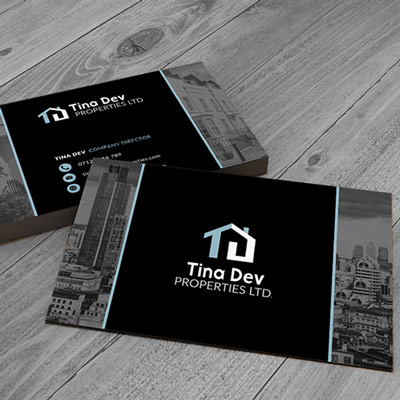
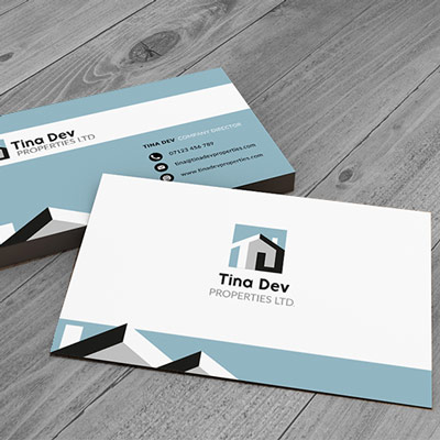
Business Card
Design variations
Final Design
I was not confident about designing my own company logo. I know Perm is thorough, creative and trustworthy, so I didn’t think twice about reaching out for her help.
Perm has a good insight into people’s choice. She is good at drawing out what you want and putting it in place. I would tell anyone considering using Perm Perry Design to “do it!” Everything will be in place fast and you can get on and focus on your business!